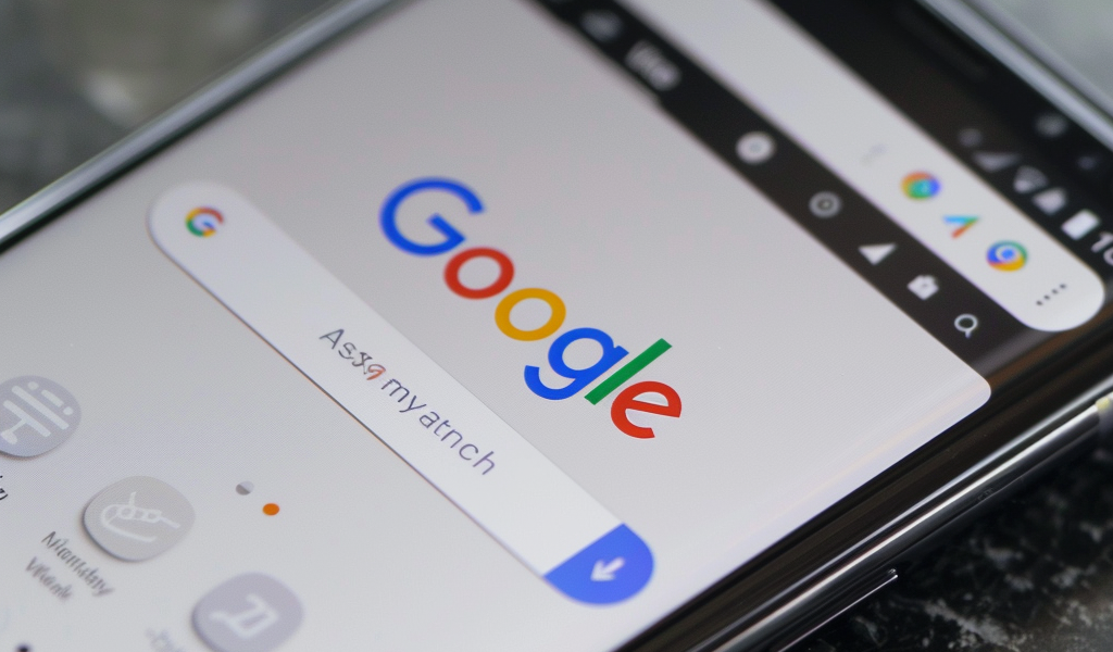
The latest update to the Google app on Android has brought a significant change to the user interface by placing the Search bar at the bottom of the browser. This new feature displays a persistent ‘Ask anything’ Search bar at the bottom of any web result or Discover article that users open on their devices.
Upon opening a Chrome Custom Tab, users will notice the familiar four-color ‘G’ logo positioned at the left side of the bar, with the microphone and Lens buttons located on the right. Tapping on the bar will direct users to a fullscreen Search page where previous queries are listed along with other suggestions as users type.
While this new Search bar at the bottom does reduce the visible space of the webpage slightly, it does not obstruct the view significantly. Users who have ‘AI tools while browsing’ enabled in Search Labs may notice a different style of bar with a slightly greater reduction in space. However, the bottom Search field seems to have replaced this variant.
There is speculation that this change could be a precursor to the Search bar permanently moving to the bottom of the main screen of the Google app. The updated feature has been observed on various devices, including tablets, following the installation of the latest Google app beta version 15.24.
This alteration in the positioning of the Search bar aims to encourage users to engage in more queries and could potentially enhance the user experience within the app. By making the Search bar more accessible at the bottom of the screen, Google is streamlining the search process for users.


