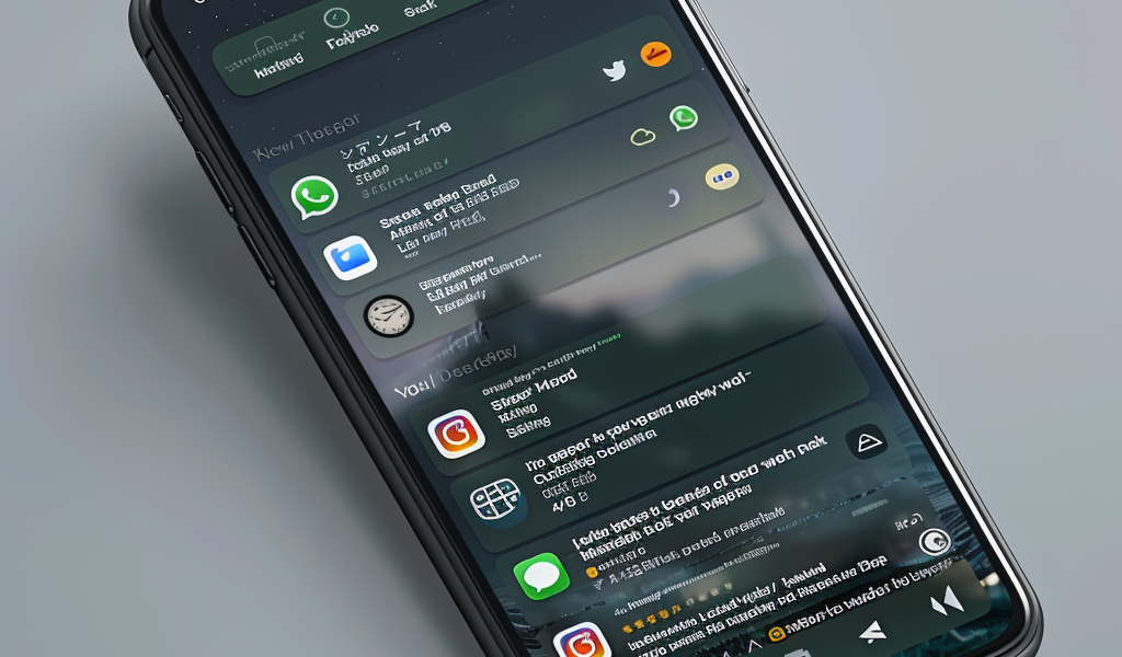
WhatsApp has unveiled its latest design updates, bringing a fresh look to the popular messaging app. The changes have been gradually rolling out, introducing a native bottom navigation bar on Android devices. The app has undergone a visual revamp, with a new color scheme selected after considering 35 different options.
The focus of the update was on incorporating deeper tones to enhance user experience in low-light settings. As part of this effort, the dark mode has been adjusted to a darker shade to improve message readability.
For iOS users, sending photos and videos has become more convenient with a new attachment layout. Instead of a full-screen menu, a collapsible tray now provides easier access to options when sharing media and documents.
Additionally, the app’s icons have been revamped with a more rounded and outlined style. The default background in chat conversations has also been refreshed, offering users a new visual experience.
WhatsApp users can expect these design changes to enhance the overall usability and aesthetics of the app. The updates aim to improve user interaction and readability, catering to a more visually appealing and user-friendly interface.


